The walls of your home are a powerful place to express your personal style, interests, and even life philosophy. Here are four tips on home art display and using artworks to achieve a look that reflects you.
What constitutes “art” in a home setting? Paintings, prints, family photos, drawings, vintage magazine covers, textiles, and many other materials fit the bill. This diversity is part of why home art hanging makes a personal statement and has a profound effect on the look and feel of a room.
At the same time, hanging art at home often poses special challenges:
- Wall space is often scarce and fragmented
- Viewing angles can be constrained by room size and shape, furniture, and other factors
- Artwork needs to fit a home’s colors, design scheme, level of formality, and mood
- Effective lighting can be difficult
- Artworks should be kept out of direct sun, which can damage pigments and materials
Fortunately, the basic approach to planning a display for a home picture gallery is similar to that used in other types of display spaces. You can get a detailed description in Everyone’s Guide to Art Hanging, a free ebook from Gallery System, but here are the key points:
Assess the Setting
No two are alike, which is both appealing and challenging. It can be helpful to envision yourself as a newcomer entering your home or a room for the first time, as this helps you imagine the all-important initial impression of your entryway, living room art, and other rooms.
Pay special attention to where your eye is naturally drawn — those areas are primary candidates for display of strong “statement” pieces. But also look for secondary spaces that can be used for more intimate presentations, including groups of smaller pieces.
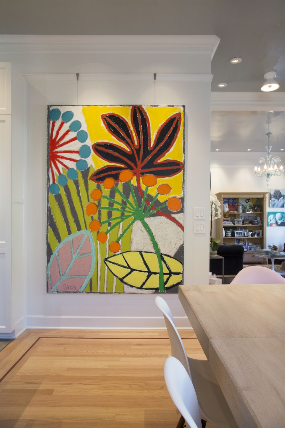
The photo at left (by Margot Hartford) shows how a short dividing wall in a California Victorian house provides a great setting for a big, bold piece of home art that’s set off well by the overall neutral color scheme. Note that there is adequate clear space around the light switches at the painting’s right, so that they do not seem jammed in. Also, in the background at far right, two smaller works bring color to a sitting area.
Decide What Story You Want to Tell
While museum exhibitions might trace how a major artist developed their style, and a gallery might offer insight into a newcomer’s fresh perspective, you’ll probably want your home picture gallery to tell a story about you, your family, your experiences, or whatever else is important to you. A great first step is to identify pieces that are truly meaningful to you — ones you really love. They may not be the fanciest ones, or the most prestigious, but these beloved items deserve special consideration, and will be good candidates for the “anchor pieces” that will star in your home’s displays.
As Christine O’Donnell, founder and director of Boston’s ShowUp arts exhibition and engagement organization notes, it’s most important that pieces in your home art display work for you. “Don’t worry about what others think. You are going to be living with the artwork day after day. Choose your favorite pieces, find others that go with them, and hang all those things together in a way that inspires you.”
Here are a few suggestions for bringing this out in your home:
Consider What’s Public, What’s Private
As you review your beloved pieces, think about which would be most appealing to a broader audience, and which are most meaningful to your family or people you live with, while always staying true to your own tastes.
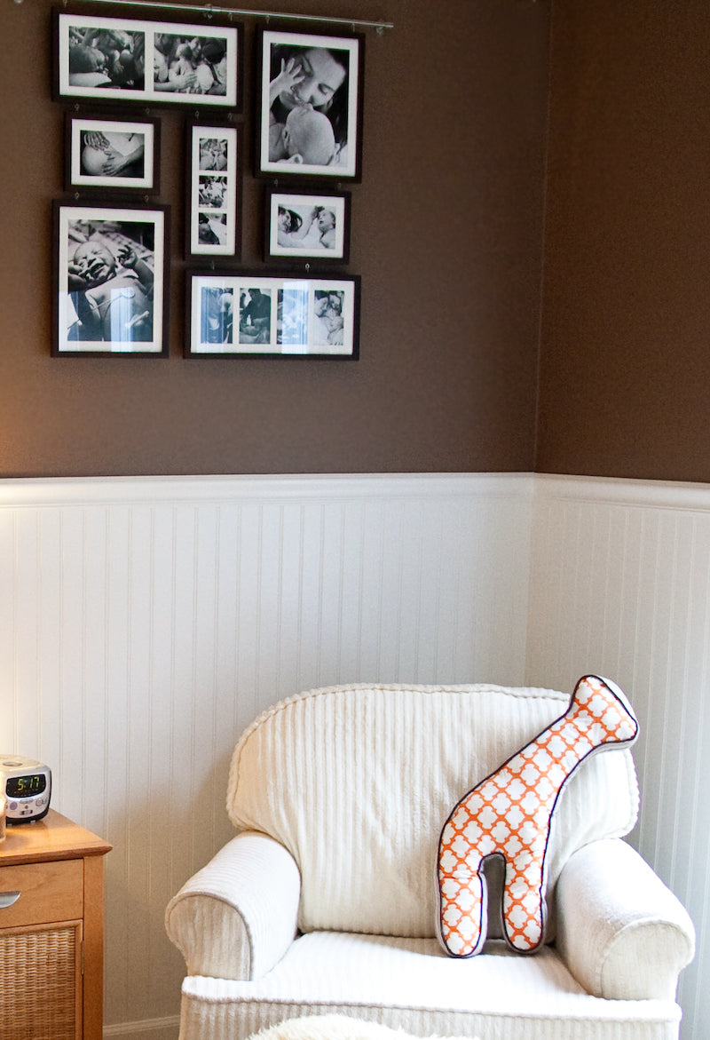
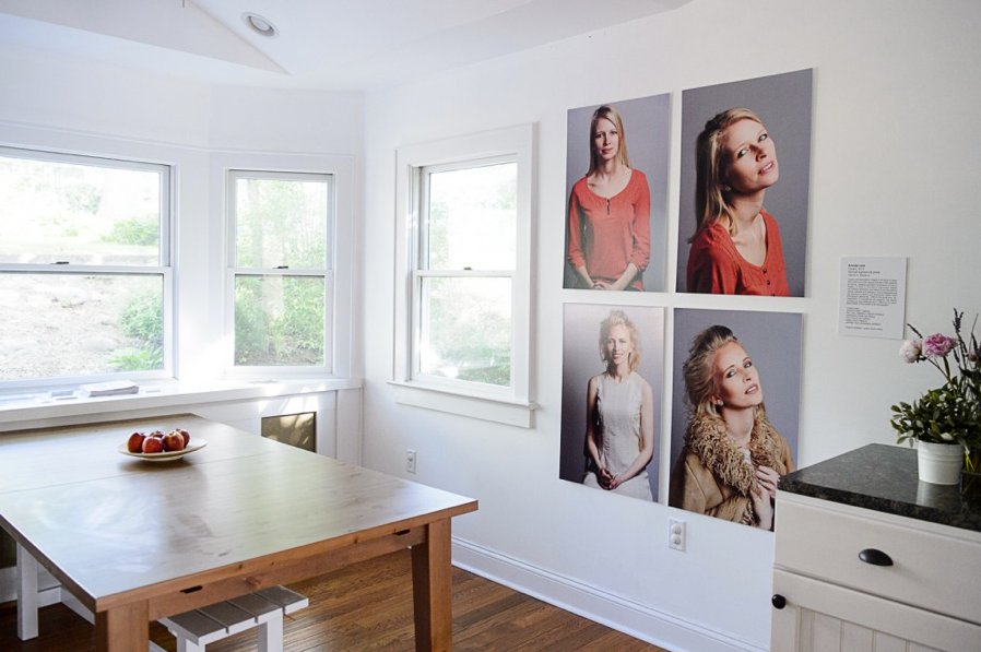
You can then consider which rooms have higher foot traffic (like the dining room and sitting area shown above) and which are more intimate, like the nursery in the photo at right. Sort your pieces in a way that will help you offer something suitable and appealing to each audience – including yourself!
The nursery display is a good example of how family photos are often better suited for the more-private areas of a home. The collected images of mother, father and baby are quite personal and might seem overly intimate if featured in a living room or other more-public area.
(Photo by Flickr user Tabitha Blue, used under Creative Commons)
Assess Your Wall Spaces
Available wall space is very often the biggest limiting factor in home art display, with windows, doorways, radiators, furniture, light fixtures, and other items all cutting down on potential display areas.
But don’t panic – there are always ways to leverage the spaces you do have for art around the house. Taking the time to make an informal assessment (or more-formal measurements) can help ensure that you make the most out of what’s available without cramming pieces into spaces where they don’t really fit.
Relatively large areas can be sometimes be found on interior walls, above sofas and mantelpieces, in entryways or corridors, or between windows. If some of your beloved anchor pieces are on the large side, the possible locations will probably narrow down fairly quickly.
At the same time, surprisingly good use can be made of spaces that might at first seem awkward or unusable. As seen in the photo at left and the detail below, well-chosen clusters of smaller images can have substantial impact. Note how the five images above the sofa make excellent use of the corner space between two windows.
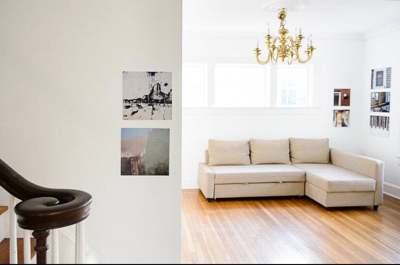

This closer look at the corner grouping shows how photos of doors, windows, corridors and fences combine into a comment on space and dimension, barriers and openings. The asymmetrical arrangement creates a strong vertical line in the right-hand column, with the square prints on the left adding visual punctuation.
This type of home picture gallery approach can be used to good effect for many types of material: collections of work by family members, memorabilia, photos of friends or relatives, magazine pages, etc. When skillfully combined, even relatively small items can create the feel of a big piece. (Learn more about creating effective groupings in our Hanging Basics series of articles.)
(Images courtesy author and photographer Ananda Lima)
Don't Be Afraid of Change
Remember that when we see the same thing in the same place day in and day out, we stop really SEEING it. Sometimes putting different pieces in different places can make them more visible.
O’Donnell notes, “I get tired of always having same things up at my house, so I’ll change it up from time to time. I love all the works that I have but enjoy seeing them in different lights or different rooms. Putting them in a new context can help you see things in a new way — different aspects might come out, or you’ll see different colors when you put new things next to each other.”
Keeping your home art displays fresh is especially true if you have a family member who is an artist. Rotating their work can help show their evolution or harken back to old favorites and provide a fuller sense of their oeuvre.
Make a Gallery Wall Sing
Gallery walls, which feature arrays of pieces in multiple rows and columns, are a hot trend in interior design these days, and a direct descendant of the salon-style approach to hanging art (read more about salon-style hanging in our Hanging Basics section).
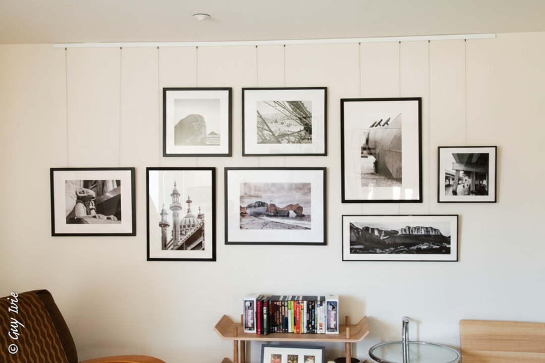
A bit of planning will help make your gallery wall appear as a cohesive whole and not a random collection. Choosing an anchor piece with strong supporting players can be a wise strategy. An excellent example is photographer Guy Ivie’s arrangement in the photo at left.
Don’t neglect the excellent storytelling potential of a gallery wall. If you’re hanging family photos, for example, consider having some sort of logical organization that gives the viewer a visual route. You could go chronologically from top to bottom or side to side, cluster groups of relatives or friends together, or find some other organizing principle that speaks to you.
When arranging multiple works, it’s essential to experiment before committing to final positions. Try laying out your arrangement on the floor or a tabletop and trying different combinations until you find one that feels logical or unified. (A picture hanging system, which allows easy positioning and adjustment of complex arrangements, can be a very useful tool in this situation.)
Most often you’ll have diversely sized and shaped pieces in your gallery wall, so you’ll need to find a combination that holds together both from a distance and up close. Having some sense of a grid is usually a good strategy, but don’t feel that you have to force things into perfect rows and spaces. And bear in mind that if a display is TOO orderly, viewers can lose sight of the pieces’ individual character!
Show us the display you're proud of — tag @GallerySystem on social media; we may reshare with our community.
Pre-Bundled Kits
It's never been easier to start hanging like a pro, and the shipping is on us!


